If your home still looks like an average rental home with the same white walls and zero personality, we need to change it immediately. It is now 2025 and your home must no way look like the cheapest short-term rental home that everyone ignores on Airbnb.
For that reason, I am giving you the best killer colour schemes that will give your home a fancy, stylish, and straight-from-a-design magazine look! I’ve got plenty of colour disaster stories in my life so you don’t have to. But if you still want to be a fancier and get the job done by profession, there’s always some interior design companies near you.
What are colour schemes?
A colour scheme is simply how you coordinate colours to avoid making your home resemble a kindergarten art project. This creates a cohesive look and also prevents a chaotic appearance.
Monochrome (one colour in various shades is an amazingly sleek look), complementary (colours diametric opposite to one another: blue and orange, but not to the max circus), or analogous (colours next to each other on the colour wheel like blue and teal, for a blended, smooth look). But what matters is to pick the best colour scheme that does not make your space look like a disaster.
Factors to be considered while choosing a colour schemes
Randomly choosing colours without thought will only lead to regret. Here’s what it means:
Lighting
In spaces that are dark with no natural light, some colours will give it the appearance of a crime scene. I once painted my full room with deep green and it looked amazing in daylight but turned into a murky dungeon at night. However, if you have tons of sunlight,
you can pull deep, moody colours.
Room Size
Dark colours in a tiny room? You contracted your world to shoe box status. Painting a large room plain white can make it feel cold and uninviting, just like a waiting room. Instead, try to use darker accents sparingly in small spaces to avoid making them feel even smaller. If the room is large, go for bold colours, but balance them out with lighter furniture instead of overwhelming the space.
Furniture Compatibility
If you have a bright red couch, avoid neon green walls unless you want a chaotic look. If your furniture is bold, keep walls neutral. If your furniture is plain, go wild with the wall colour.
Moral of the story? Think before you paint. Your walls deserve better.
Most Popular Colour Schemes for Home Interiors in 2025
1. Moody Midnight

Image Source: pinimg.com
Let’s be honest as dark rooms are just sexy. Deep navy and charcoal have a way of announcing “I have my life together” even if you most definitely do not. Once, I painted my bedroom a rich, moody blue and felt like a mysterious artist or a poet at night. My space looked incredibly expensive after that.
The trick here is to balance the darkness with something warm and gold accents. Brass light fixtures, a velvet mustard pillow and a gold framed mirror. Otherwise, your space might end up feeling like Batman’s cave, which is cool in theory but not in practice. And lighting is crucial. A single dim overhead light can create unflattering shadows so use warm lamps or LED strips behind furniture for the best effect. Instant mood.
Best room for this? Bedroom or living room. Yes, it is cosy, and moody and makes you feel like the main character in a film noir.
2. Earthy Elegance

Image Source: indicus.in
I never imagined myself loving earthy tones, but now I do. Terracotta, olive green, and beige have a way of making any space look effortlessly chic and it’s the kind of home where you can expect fresh flowers and an award-winning olive oil collection.
The key to nailing this vibe? Textures. A plain beige wall is more boring until you make it into an interior design genius by adding a woven rug, linen curtains and a few wooden pieces. Terracotta walls also hit differently. I was doubtful at first, but when I painted my office a perfect burnt orange, I felt like it sparked my creativity. It is a fact that warm colours always give a space an inviting feel.
This is also the colour you’ll need if you’d like your home or office to resemble an aesthetic of “I drink matcha and do yoga”. Cosy, stylish, and lowkey, with an “I have my life together” vibe without actually having cereal for dinner.
3. Sunset Glow
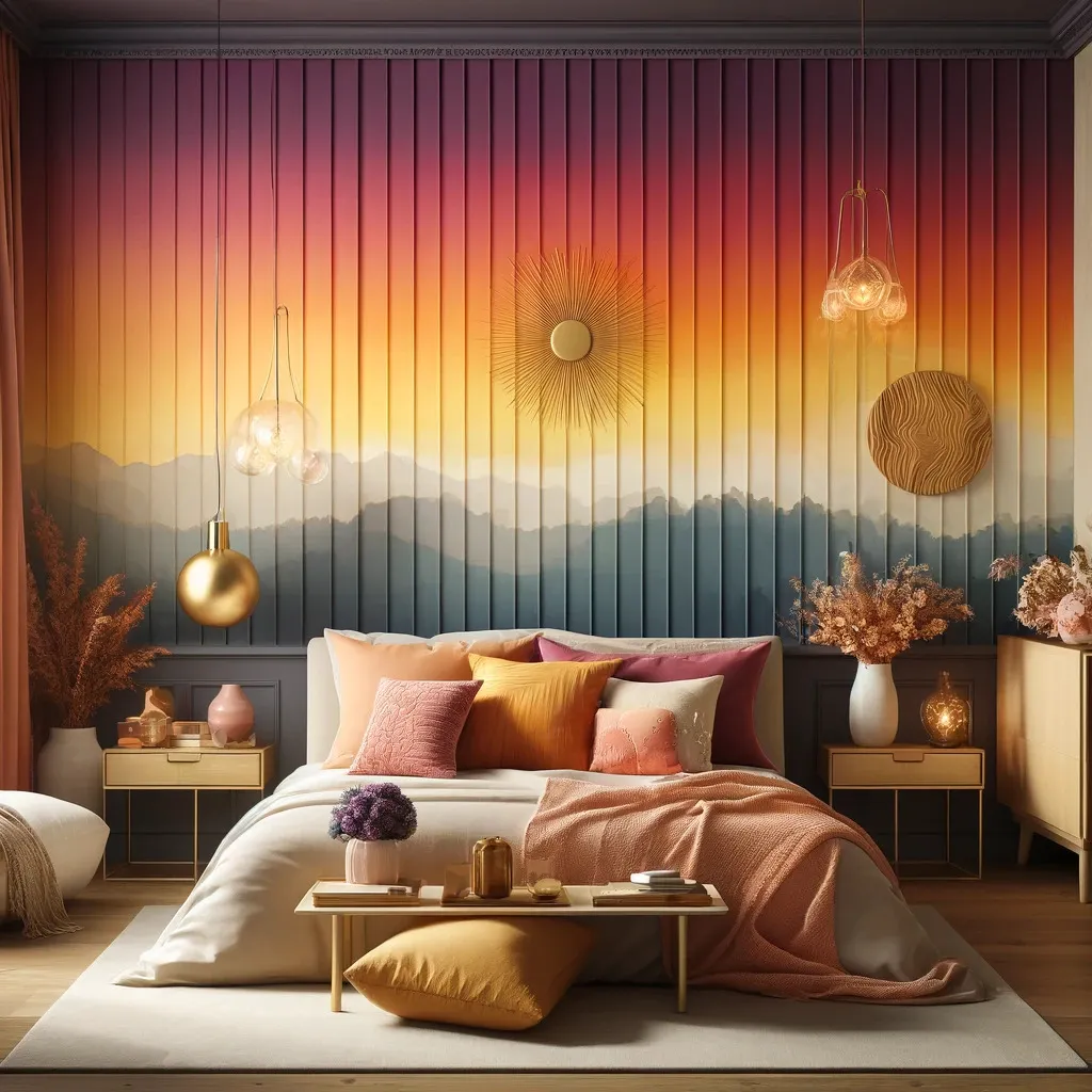
Image Source: hausvibe.com
I completely blame Instagram for my obsession with this colour scheme. When I look at a perfectly photographed room with a tonal sunset, I want to chuck all of my neutral furniture out of the window. Peach, blush pink, and muted coral create a warm, inviting home like a charming café in Paris.
My tip here is to layer the shades. For instance, in the past, I went all in with a peach wall which is cute, but I was missing something. At that point, soft pink throw pillows with coral candles and a more muted orange rug became game changers. It was always like the golden hour. Bonus? The colours suit your skin. Selfies in this lighting? Flawless.
Good for a bedroom or office, it’s peaceful but still lively enough to give a sense of fun. Be careful before you commit, or you may find yourself in a room that resembles a giant bottle of rosé exiting mid-drunk.
4. Concrete Cool
Image Source: futurecdn.net
You know, that effortlessly cool, modern industrial look that makes you feel like you’re living in a high-end loft even if you’re living in a tiny apartment? Greys, slate, soft white, working its magic yeah. I was suspicious of grey walls, for example, I thought I’d get tired of the colour quickly, but surprisingly, I haven’t. If you do it right, it is sleek as hell.
Mixing textures and tones keeps your space warm and prevents it from feeling cold and lifeless. There was no greenery except for my friend’s apartment, which fully embraced the ‘concrete jungle’ aesthetic. It was quite the corporate office. However, shift the lighting to warm, layer with more textured fabrics and incorporate a little greenery, and it creates so much of a difference like it’s the actual industrial chic that you do want.
If you want a space that exudes sophistication, like someone who drinks black coffee and owns custom furniture. Clean, and modern and works best in a kitchen or bathroom to make every appliance fancy. Don’t forget to soften it up with some wood or something warm-toned if you’re not going for futuristic spaceship vibes, though.
5. Dopamine Brights
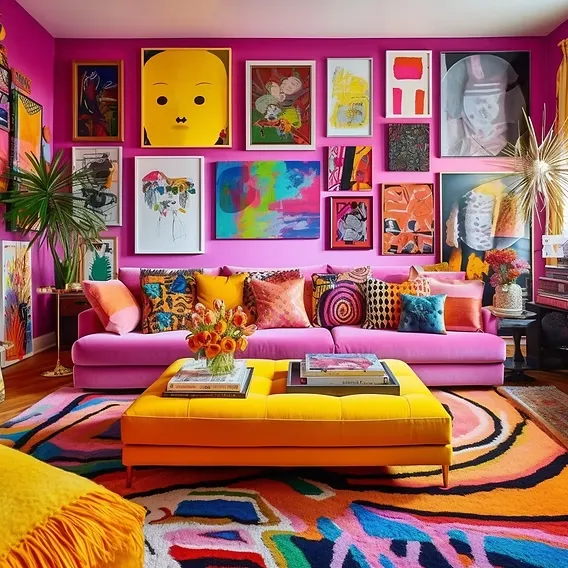
Image Source: wixstatic.com
Electric blue, bold yellow and playful pink will appeal if you are partial to attention (or just wish your home to radiate pure joy). Fun and loudness create a vibrant, playful atmosphere. On a whim, I painted one wall electric blue, and suddenly my apartment felt like an art studio despite my lack of painting skills.
The thing is that balance is important. Full neon in every corner will surely result in making your house look like a kid’s birthday party. Instead, choose one bold colour for the star and the other colours for the accents. A yellow couch with pink artwork? Yes. A full-on rainbow explosion? Probably not the best idea unless you’re designing a playroom
If you go for this scheme, keep it balanced as it’s best for offices, playrooms, or any space where you want an energetic vibe. This bold and playful colour scheme is like a shot of espresso which instantly energizes your space. After all, if you want colour, may as well go through the roof.
6. Nature’s Neutral
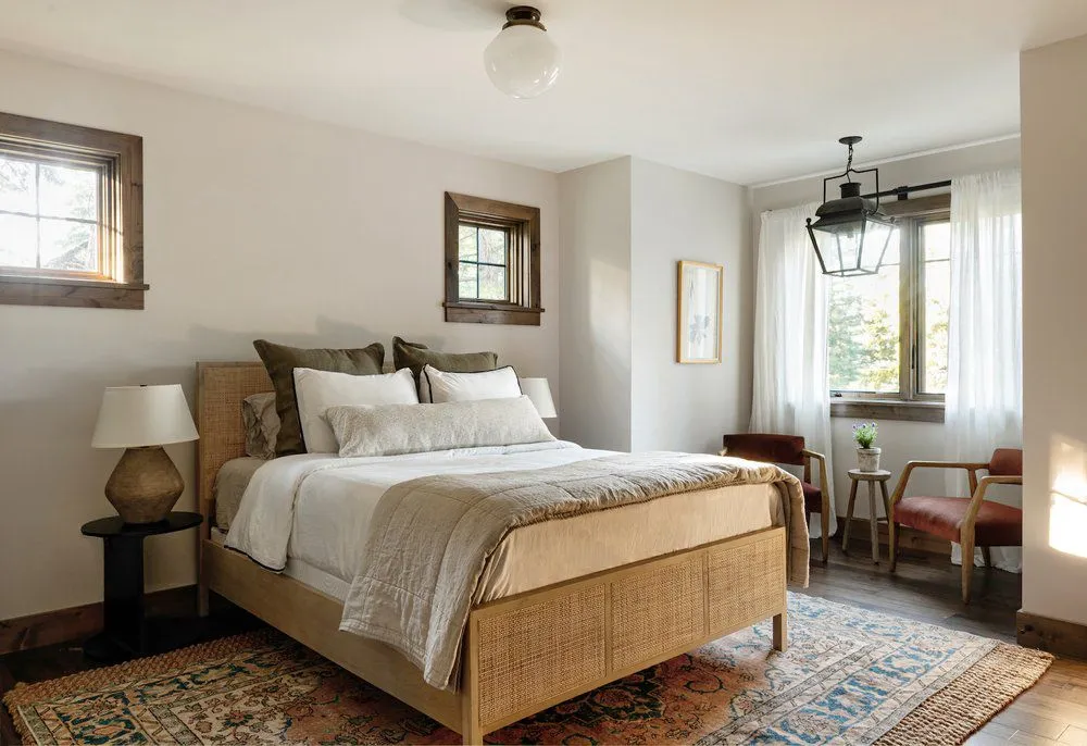
Image Source: thespruce.com
I never thought I’d be the kind of person who ascribes to raving about neutrals but, here we are. Muted sage, soft taupe and natural wood are just something that vibes together, it’s like your home takes on a breath of fresh air. Every time I step into my sage-green bathroom, I feel like I’m at a luxury spa except for the laundry pile.
The secret here? Texture. But if you go full neutral and neglect texture, your place will take on the quality of a waiting room. Add linen curtains, a chunky knit throw, and some rattan or reclaimed wood for an effortlessly stylish and cosy feel. Also, plants. You need to put in something green, like a fiddle-leaf fig.
This colour scheme will appeal to those who want to have a home that feels quite calm, vintage, and almost like a Pinterest board becoming real. Ideal to fill the bedroom, living room, or wherever you want to feel like vacationing at your favourite fancy Airbnb in the countryside.
7. Blackout Drama
Image Source: hearstapps.com
To be honest, I don’t care what anyone is saying, black walls are badass. Suddenly, when I painted one of my walls matt black, I felt like I had levelled up in life. I use deep green and brass accents in a room and somehow, they give the room a feel that you just have a private space. You walk in, and suddenly you need a whiskey in one hand, with jazz playing in the background.
Going for dark colours is a whole ordeal if you want to do it right. Warm, but dim lighting in your space is vital. You don’t want your space to look like a dungeon. And balance, people! If you paint your walls black or deep green, balance it with lighter furniture, velvet textures, or metallic accents to avoid a cave-like feel. Finally, I installed brass hardware on my cabinets and Boom. My space instantly looked high-end.
Pro tip: It is great for offices, bedrooms or statement dining rooms. If you can pull this off, this scheme is not for the faint of heart. Your space will be damn expensive.
8. Cozy Cafe
Image Source: squarespace-cdn.com
It may sound dramatic but I don’t care much about the overpriced works of art that hang on your walls. I want my home to feel like a cosy, upscale coffee shop where they play soft indie music and serve their oat milk lattes in handmade ceramic mugs.
Warm browns, latte tones and soft cream do just that for a space. I cannot tell you how much I swear, once I switched from super cold white walls to warm beige in my apartment I felt like 10 cosier the second.
For this look wood is your best friend. Begin with wooden tables, from shelves to a leather (If you’re lucky enough) armchair. Don’t forget soft lighting as fluorescent bulbs definitely ruin the whole vibe. Warm, dimmable lights or even fairy lights add extra cosiness.
This scheme is also perfect for a kitchen or living room where you want a warm, relaxed atmosphere.
9. Icy Luxe
Image Source: plainfancycabinetry.com
If you want to create a high-end, crisp, just a bit dramatic space, meet crisp white, frosty blue, and silver metallics. With a futuristic, ultra-clean appearance, it makes you want to spruce yourself up at all times.
I tried this look in my bedroom, and if you love the luxurious feel of a five-star hotel, you’ll be obsessed. The key? Texture, texture, texture. A plain white wall and a grey couch can feel colder and more boring. Try to throw a fluffy white throw and some glossy silver accents, and now your home has an appearance of ‘the’ house.
Great for a bathroom or bedroom, it makes everything better, fresh, bright and expensive. Just don’t go too cold with it if you aren’t planning on getting a full-on spaceship vibe.
10. Vintage Revival
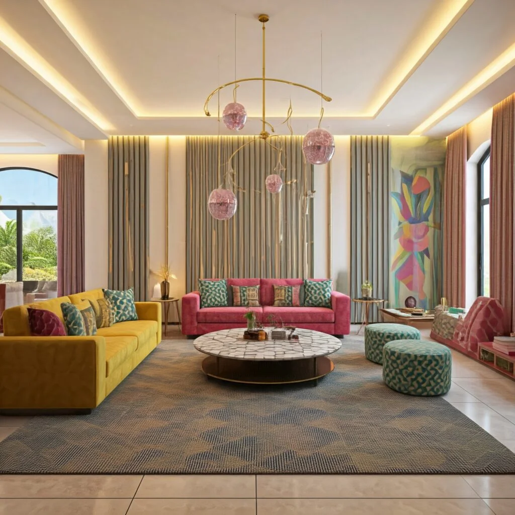
Image Source: euphoriainteriors.com
Want to add a touch of cool, retro charm with a modern twist to your home? This is your sign; invest in mustard yellow, burnt orange and deep teal. It is just the right poppy and nostalgic without feeling it is raiding your grandma’s attic.
Once I went through a huge vintage phase and an accent wall mustard yellow is what I did. At first, I panicked. Was it too much? Was I about to nullify my whole vibe? But the second the deep teal chair and some warm wood tones were paired with it, I was OBSESSED. It was bold yet curated, like I finally knew what I was doing in interior design.
The key here? Balance. Vintage colours are easy to do, so match them with neutrals or wood tones to secure the vibe. It’s ideal for a living room or an office where you would prefer to have creative, artsy energy.
Bottom line? This scheme brings retro charm with a modern twist and it is perfect if you love a touch of vintage style.
Final Thoughts
Moral of the story? Your home deserves better. Whether you go for moody, earthy, vintage, or futuristic vibes, commit to it. No more boring, lifeless walls. And if you’re lost? If you love luxury, maybe consult a top interior design firm. It is 2025 and things have changed a lot in the last few decades. So, if you still have not upgraded yourself just do it now. What you need is just a paintbrush so grab it and make your best colour schemes.